Paper Stocks Explained
Bolt Print / 27 April 2026
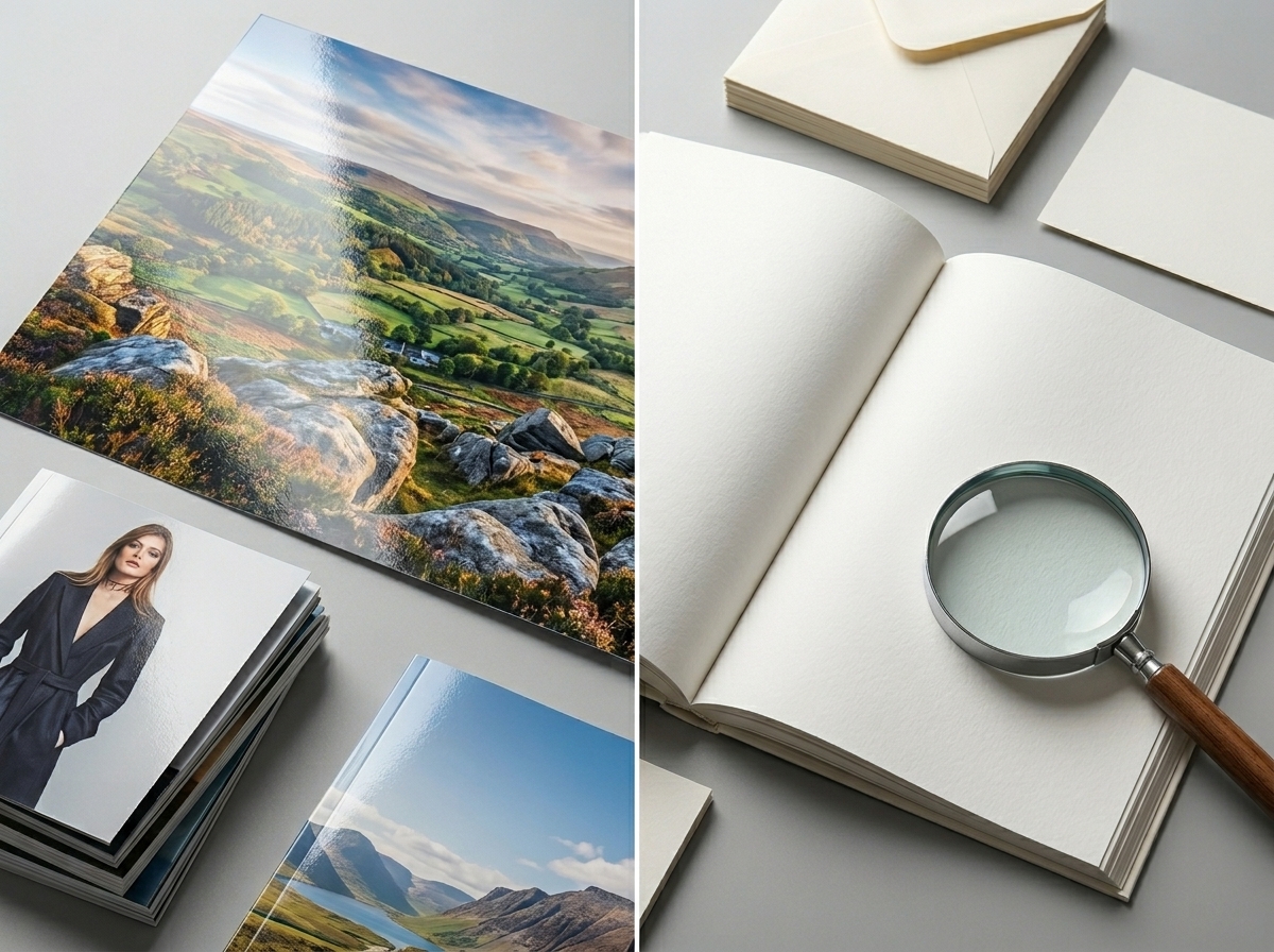
Choosing the wrong paper stock is one of the most common — and costly — print mistakes. Whether you're ordering business cards, flyers, brochures, or packaging, the paper you print on affects how your brand looks, feels, and lasts. This guide cuts through the confusion so you can order with confidence.
Part 1
What Does GSM Mean?
GSM stands for grams per square metre — it's the standard measurement for paper weight across Australia and the UK. The higher the GSM, the thicker and heavier the paper. Simple as that.
Think of it like this: standard office printer paper sits at around 80gsm. Pick up a premium business card and you're likely holding something closer to 400gsm. The difference in feel is immediately obvious — and that feeling communicates something about your brand before a word is read.
Newsprint
Brochures
Menus
Postcards
Luxury packaging
Common GSM ranges and what they're used for
70–90gsm is the everyday zone. It's economical, practical, and fine for high-volume print runs like catalogues or newspaper inserts. Don't expect it to make a strong first impression on its own.
115–135gsm is the sweet spot for most commercial print work. Flyers, brochures, and newsletters almost always land here. It's substantial enough to feel professional without driving up cost significantly.
170–200gsm steps into what printers often call "cover weight." Menus, event programmes, and folded brochure covers tend to sit in this range. There's a noticeable rigidity that reads as quality.
300–400gsm is business card and postcard territory. When someone picks up a card at this weight, the tactile experience alone does a lot of selling for you. This is where premium really begins.
Bolt Print tip: If you're unsure, always request a paper sample pack before committing to a large run. Feeling the stock in your hands is worth far more than any specification on a screen.
Part 2
Coated vs Uncoated Paper
Beyond weight, the surface treatment of your paper has a huge impact on how ink sits, how colours render, and how the final piece feels in the hand. The fundamental choice is between coated and uncoated paper.
Coated Paper
Coated paper has a surface layer of clay or other minerals applied during manufacture. This seals the fibres, creating a smooth, consistent surface.
- Ink sits on top rather than absorbing in
- Vivid, sharp colour reproduction
- Fine detail and photography reproduces beautifully
- Dries quickly with less risk of smudging
- Less tactile warmth — feels sleek and refined
- Photography brochures and lookbooks
- Product catalogues
- Posters and display material
- Annual reports
Uncoated Paper
Uncoated paper has no surface treatment. The fibres remain open, giving it a natural, breathable texture that reads as honest and tactile.
- Ink absorbs into the paper, slightly softening detail
- Warm, natural feel — closer to writing paper
- Highly writable and receptive to pen
- Earthy, craft aesthetic
- Better environmental credentials in many cases
- Letterheads and stationery
- Envelopes
- Premium craft packaging
- Eco-conscious brands
Neither is universally "better" — the choice depends entirely on your brand personality and the purpose of the printed piece. A law firm's letterhead might deliberately choose uncoated for its gravitas and writability. A fashion retailer's product catalogue demands coated paper to make imagery pop.
Bolt Print tip: If your design includes large areas of solid dark ink on uncoated stock, allow for slightly lower saturation in your artwork. Ink absorption can make dark colours look heavier and less precise than on coated paper.
Part 3
Matte vs Gloss — and Everything in Between
Once you've decided on coated stock, you have another choice: the finish. This is about light reflectivity and the overall look and feel of the printed surface. The spectrum runs from dead flat matte through to high-shine gloss, with silk (sometimes called satin) sitting in between.
Uncoated
Natural
texture
Matte
Flat
no shine
Silk / Satin
Soft
subtle sheen
Gloss
High
reflective
Matte Finish
Matte has no sheen whatsoever. Light doesn't bounce off it, which means no glare and a subdued, sophisticated look. It's widely favoured in premium and luxury design.
- Elegant and understated — reads as high-end
- Easy to read in any lighting condition
- Excellent for text-heavy designs
- Can be written on (unlike gloss)
- Popular for business cards and luxury brochures
- Shows fingerprints more obviously
- Colours appear slightly less vivid than gloss
Gloss Finish
Gloss has a reflective, shiny surface that makes colours look rich and saturated. It's the go-to choice when vibrancy and impact are the priority.
- Colours appear bolder and more vivid
- Photography and imagery looks stunning
- More resistant to moisture and handling
- High visual impact — stands out in hand
- Can create glare in bright lighting
- Feels less premium in some contexts
- Cannot be written on with standard pens
What about silk or satin finish?
Silk (or satin) finish is the thoughtful middle ground that many designers reach for. It offers better colour vibrancy than matte without the harsh reflectivity of gloss. Text remains sharp and legible, imagery looks polished, and the overall feel is one of quality without ostentation. For most brochures, leaflets, and marketing collateral, silk coated stock is the workhorse of the commercial print world — and for good reason.
Part 4
Which Stock Is Right for Your Project?
Rather than trying to hold all of this in your head, use the table below as a quick reference. These are the recommended combinations Bolt Print uses most often for each product type.
| Print product | Recommended stock | Finish |
|---|---|---|
| Business cards | 350–400gsm | Matte laminate or Gloss laminate |
| Flyers & leaflets | 115–130gsm coated | Silk or Gloss |
| Brochures (text-heavy) | 130gsm coated | Silk |
| Brochures (image-led) | 150gsm coated | Gloss |
| Booklet covers | 250–300gsm coated | Matte laminate |
| Letterheads & stationery | 100–120gsm uncoated | Natural |
| Posters | 150–170gsm coated | Gloss or Silk |
| Postcards | 350gsm coated | Silk or Matte laminate |
| Menus | 200gsm coated | Matte laminate |
| Eco / craft packaging | 300–400gsm uncoated | Natural kraft |
Part 5
Special Finishes and Lamination
Once you've nailed your base paper stock, special finishes can elevate the piece further — turning something that looks good into something that feels extraordinary. These are applied after printing, either to the entire sheet or as spot treatments to selected areas.
Matte lamination
A thin matte film bonded to the surface. The result is a velvety, non-reflective feel that's incredibly tactile and reads as genuinely premium. It also adds durability and scuff-resistance. Extremely popular for business cards, folders, and premium brochures. Pair matte laminate with spot UV varnish for a compelling contrast effect — the rest of the card stays flat whilst your logo shimmers.
Gloss lamination
The same process with a gloss film. Protects the print, deepens colour saturation, and gives that polished, high-shine result. Common on promotional flyers, catalogues, and retail packaging where visual impact is the priority.
Spot UV varnish
A clear, glossy varnish applied selectively to specific areas of your design — a logo, a headline, a product image. Against a matte laminate background, spot UV creates a striking contrast between flat and shiny that immediately draws the eye. It's a favourite for premium business cards and corporate stationery.
Soft-touch lamination
Sometimes called velvet or peach-skin lamination, soft-touch creates a surface that feels almost rubbery to the touch — like the cover of a high-end notebook. It's the most tactile finish available and carries a significant "wow" factor. Preferred by luxury brands, high-end restaurants, and any business that wants their printed materials to feel as considered as everything else they do.
Foil stamping
A metallic or pigmented foil pressed onto the paper using heat and pressure. Gold and silver are classic, but rose gold, holographic, and matte black foils are all popular. Foiling adds genuine sparkle and communicates luxury in a way that ink alone cannot. Often used on wedding stationery, premium business cards, and packaging.
Bolt Print tip: When using soft-touch or matte lamination, ensure any artwork containing ink goes right to the edge of the design. Lamination can slightly alter the colour balance — your Bolt Print account manager can advise on colour adjustments before the files go to press.
Part 6
Sustainable Paper Choices
More and more businesses are asking us about environmentally responsible paper options — and rightly so. The good news is that sustainable doesn't mean compromising on quality.
FSC-certified paper is sourced from responsibly managed forests and carries the Forest Stewardship Council mark. Bolt Print uses FSC-certified stocks across most of our standard range. If FSC certification matters to your brand or clients, let us know and we'll ensure your job runs on certified material.
Recycled stocks are available across both coated and uncoated ranges. Modern recycled papers print beautifully and are virtually indistinguishable from virgin fibre stocks in most applications. They typically carry a natural, slightly warmer tone that many sustainable brands actively choose for its authenticity.
Uncoated and natural stocks often have a lower environmental footprint than heavily coated papers, as the manufacturing process is less intensive. Opting for uncoated stock is a simple choice that aligns with an eco-conscious brand position.
Summary
The Quick Cheat Sheet
If you've skipped ahead or just want a fast answer, here it is:
GSM = paper weight. Higher is thicker and more premium. Match the weight to the job — don't use flimsy stock for business cards or unnecessarily heavy stock for bulk flyers.
Coated vs uncoated = surface treatment. Coated gives vivid colour and sharp detail. Uncoated gives warmth, texture, and writability. Images → coated. Stationery → uncoated.
Matte vs gloss = finish. Matte is sophisticated and text-friendly. Gloss is vivid and eye-catching. Silk sits neatly in between and works for almost everything. When in doubt, choose silk.
Special finishes = the detail that makes the difference. Matte laminate + spot UV is the classic premium combination. Soft-touch for luxury. Foil for occasion pieces.